What we did
- UX design
- Conceptual digital design
- Content creation
- Digital style guides
The work
The Australian Corporate Bond Company (ACBC) launched its flagship investment product, Exchange Traded Bonds (XTBs) in May 2015.
XTBs are a new product; disruptive in the market and potentially a game changer within the fixed income investment sector.
Following the development of an equally disruptive brand identity, Yell was tasked to translate this into a digital experience that would educate investors and set an expectation of the performance that they would receive by investing in XTBs.
As a retail investment product, XTB has two target audiences: investors and advisers.
As the first of its kind asset class in Australia, both audiences required education on XTBs, how they work and the role that they play in investment portfolios.
We developed content to move users through the educational journey towards a conversion. For investors, this was to select an XTB that meets their requirements, calculate a potential return and send this to their adviser or broker to execute the trade.
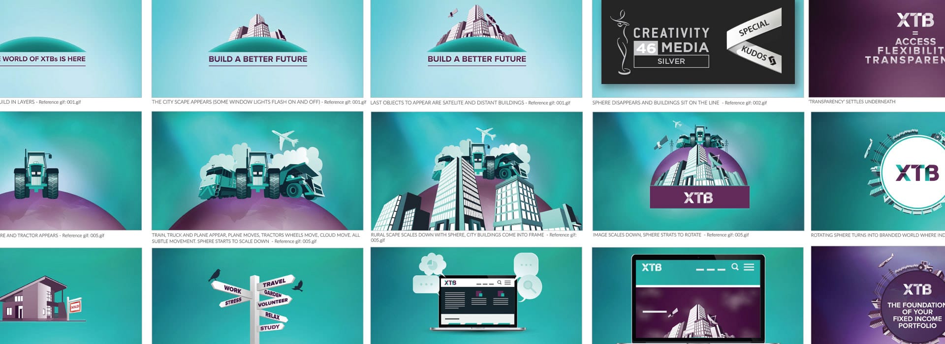
To ensure that users were engaged throughout the site, we used different content types for each part of the user journey. From an animated explainer video and copy that simplifies complicated financial concepts, to tools that help users find the right products and calculate a tangible investment benefit.
The solution
Structure and navigation
We created a landing page that asks site visitors to identify themselves as either an ‘investor’ or ‘advisor’, used to guide users to targeted content.
Asking users to self-select in this way means that their experience is personalised. Each user is cookied, so upon returning to the site they are not required to self-select again, enhancing their experience.
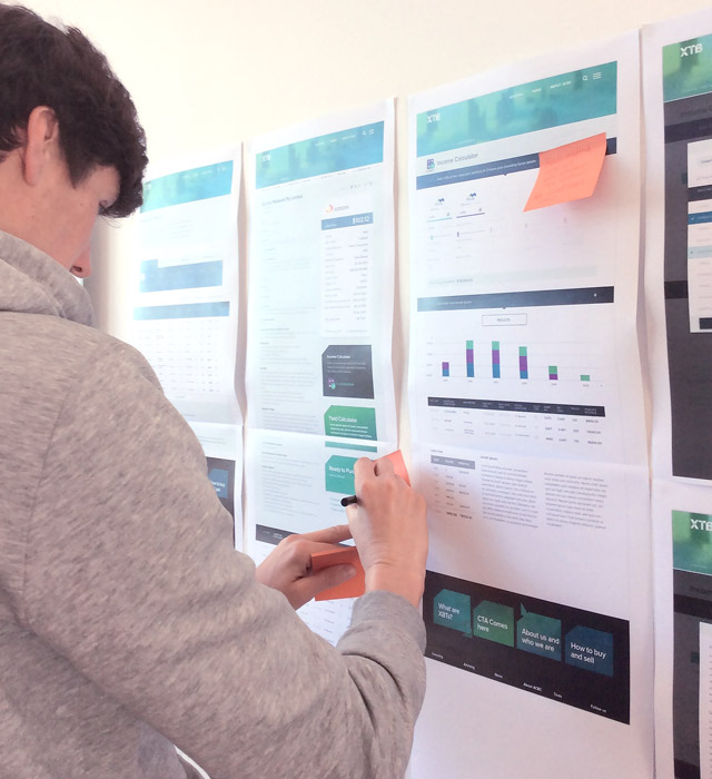
Audiences are then taken on a logical journey through the site – starting with high-level information on the homepage, then guiding them through what XTBs are, how they work, what XTBs are available and then finally how XTBs can benefit them individually.
Visual design
The design of the XTB site is derived from the distinctive brand that differentiates XTBs from other financial brands. The challenge was to apply this identity to an online environment without losing the clarity of communication.
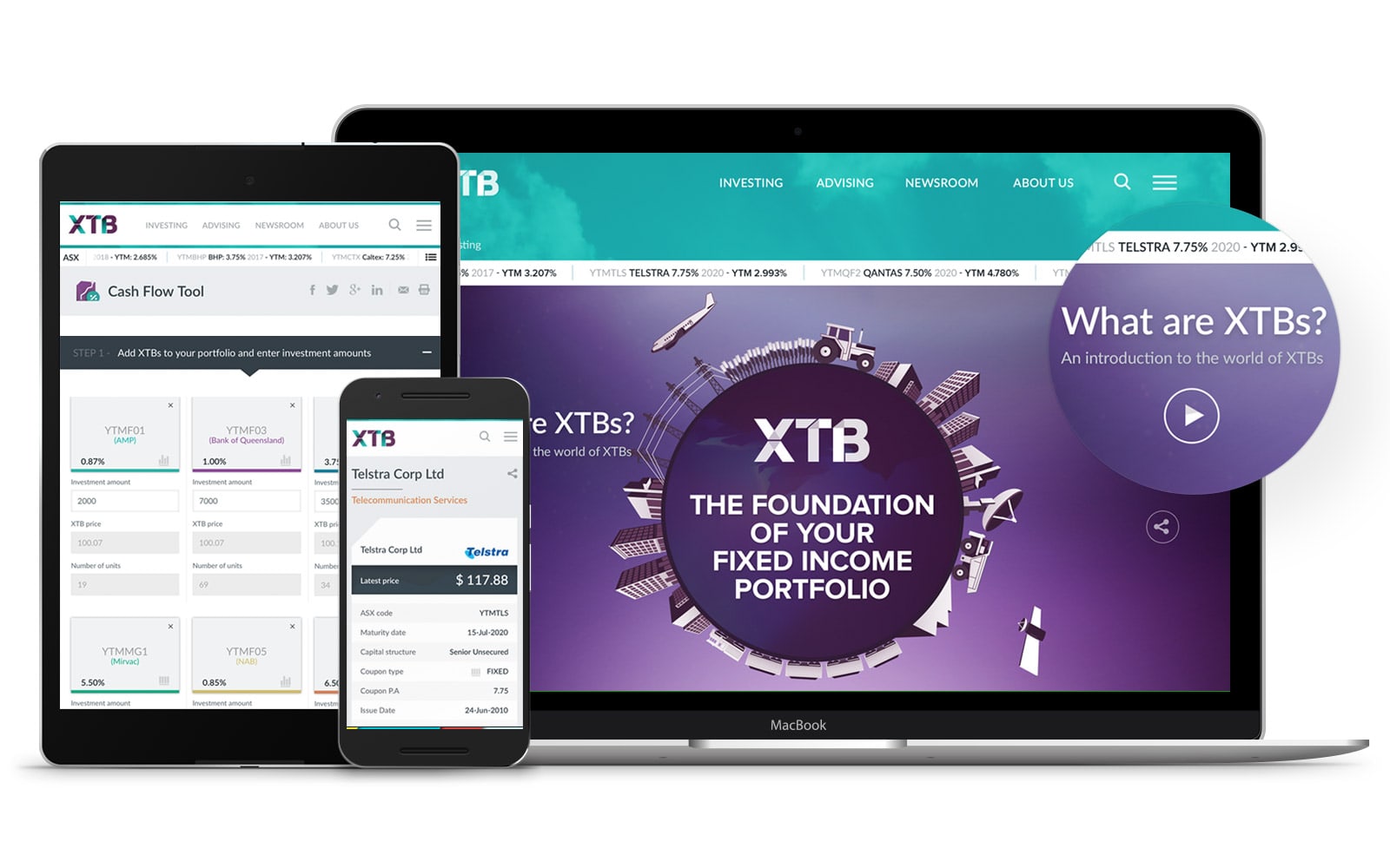
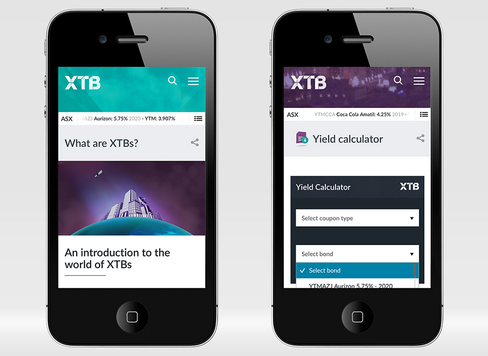
Research into audience user habits showed that they use their commute to conduct research, so the site design (and content) was built mobile-first.
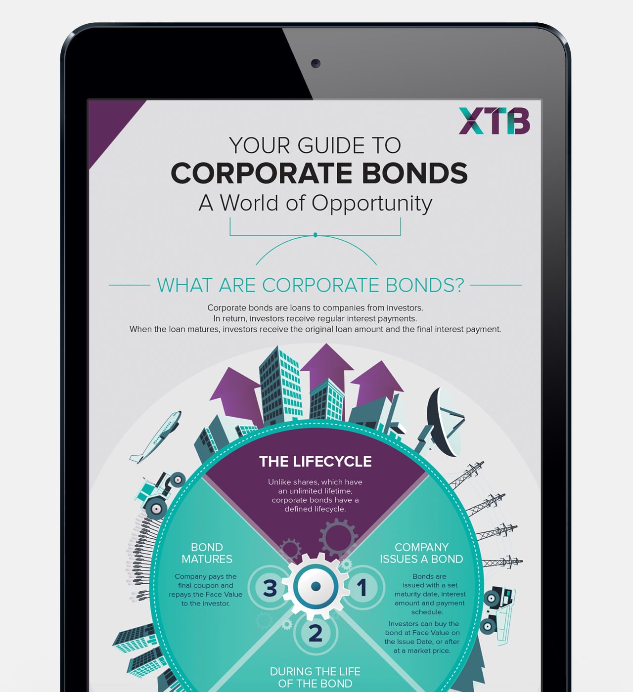
Throughout the site, imagery and custom icons are used to aid communication and demystify what could otherwise be complex information. The brand and the visual design all contributes to the feeling of transparency to aid understanding.
Functionality
The XTB site incorporates world-first functionality in its Cash Flow Tool. While most financial projection tools use abstract rates, which don’t provide direct tangible results, the XTB calculators use daily updated information to ensure that calculations are accurate and relevant.
The ‘Cash Flow Tool’ enables users to build a portfolio of XTBs and visualise the timeline of income during the life of their investment.
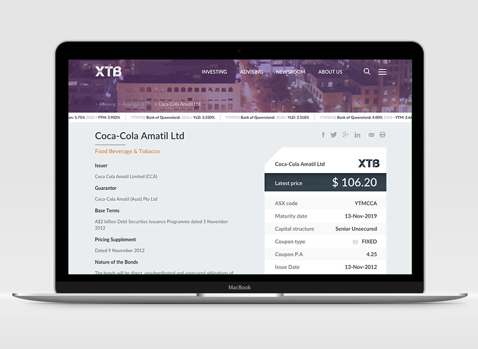
The daily XTB data update is utilised throughout the site, from the calculators, to the ticker that runs across the homepage to the individual detail XTB product pages. Each helps users understand the tangible benefit of what an investing in XTBs.
Interactivity
The site features multiple interactive elements, including scrolling tickers that can be clicked to view more detailed information on that product, explainer and media videos and calculator tools. At each stage of their journey users are invited to interact with the information to learn more, dig deeper and see how investing in XTBs can benefit them.
What could be a staid and dry one-way transfer of information has been transformed into an interactive experience, which ensures that users are engaged, informed and then prompted to take action.
