The work
Our most rewarding projects are those where we’re asked to take our clients on a journey and deliver real change for their customers. Or, in this case, members.
Qantas Super, the superannuation fund for current and former Qantas employees, asked Yell to do just that, and deliver the first phase in a 3-year digital member experience (DME) roadmap.
Our overarching brief was to create the “best super site in the world” – bringing super to life for Qantas Super members and encouraging them to take the actions needed to ensure they could have a great life after work.
As with many super audiences, a major challenge was how to stir people from their apathy – highlighting that super is their money and that there are simple things that they can do to make a difference to their total savings.
A further challenge was the diversity of the audience. Qantas Super members range from baggage handlers in their first job to retired long-haul pilots. We therefore needed to deliver a solution that would meet the needs of a varied demographic, a range of usage and device habits and of actions that needed to be taken.
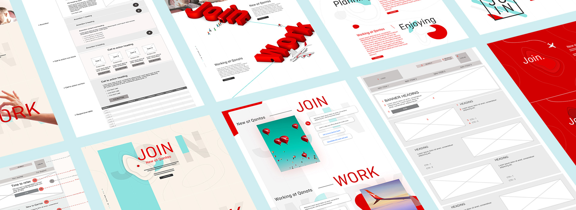
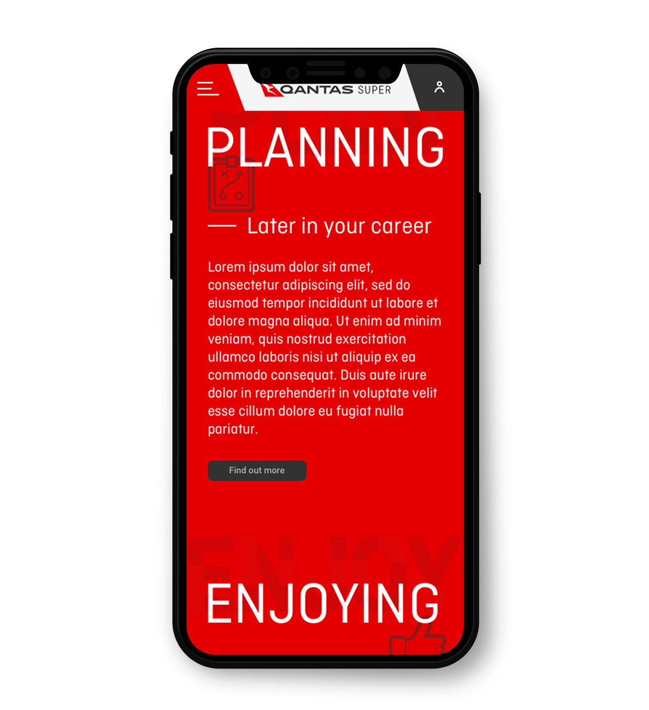
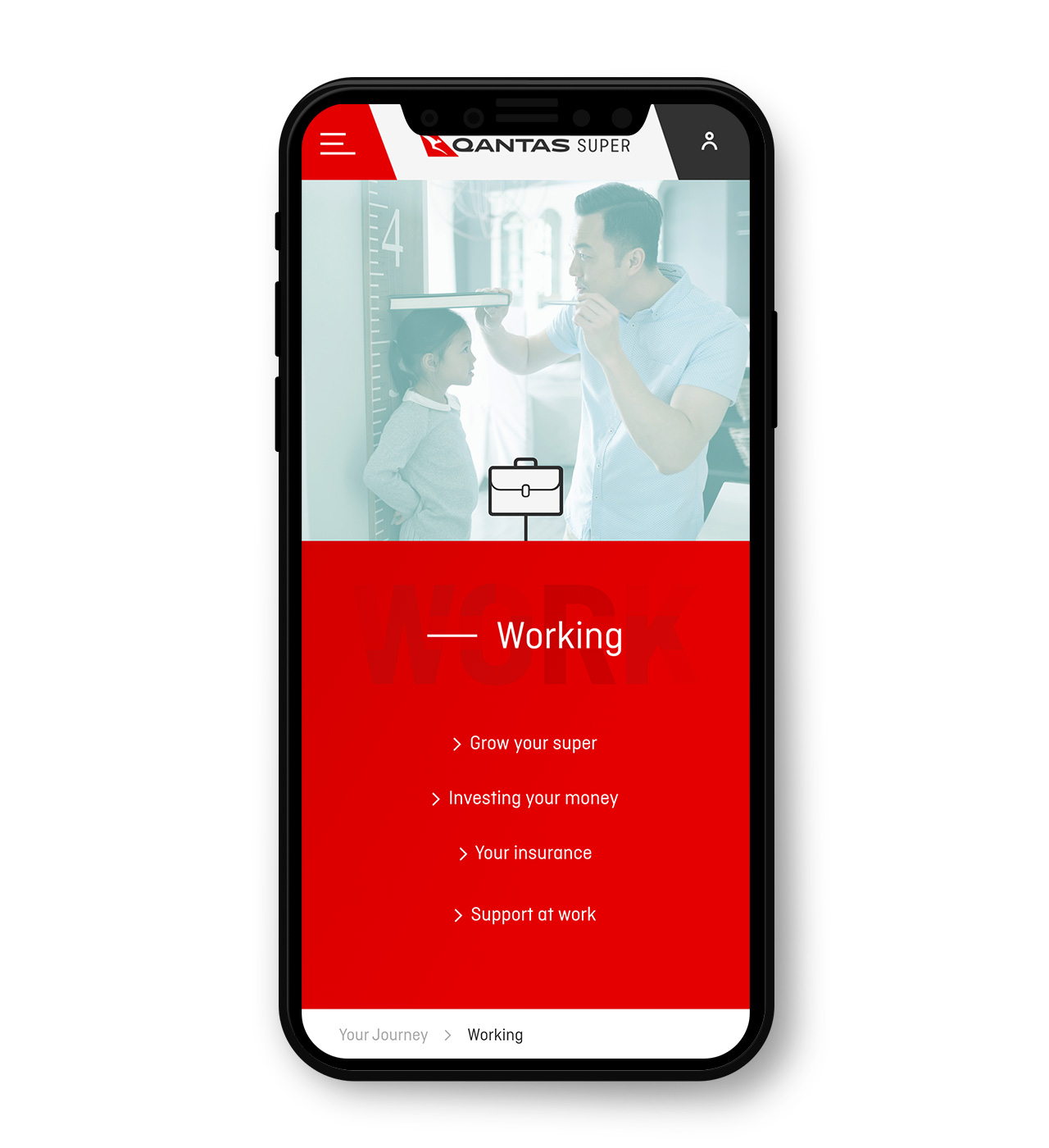
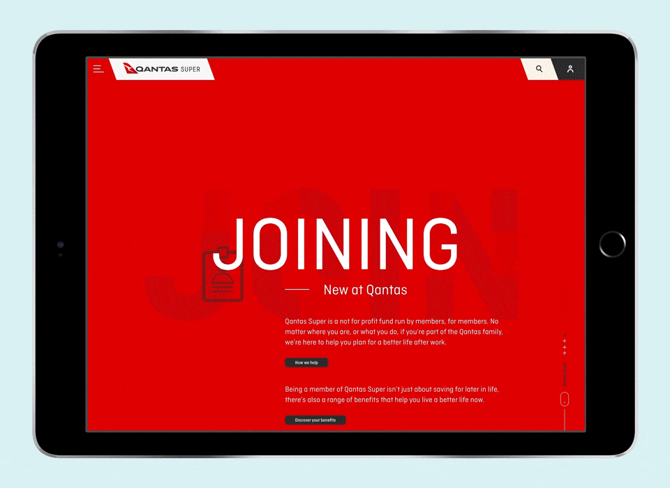
As part of the strategy and service design component of the project, four key personas were developed to represent the four core stages of the super lifecycle: when a member joins a company; when a member is working and contributing to their super; when a member is planning for retirement and when a member has actually retired. Meeting the needs of members at each of these four stages became the cornerstones of the digital experience – informing the information architecture, visual design, interactions and the entire user experience.
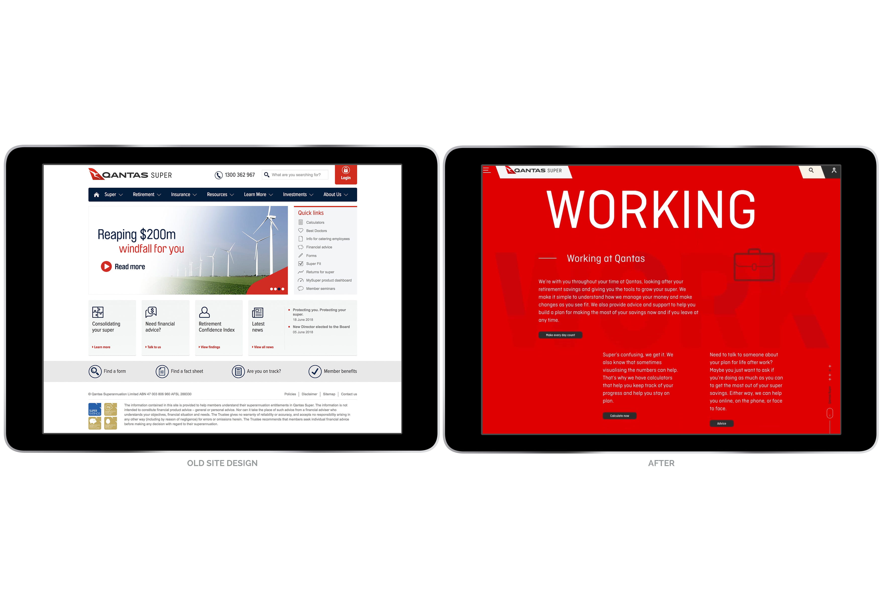
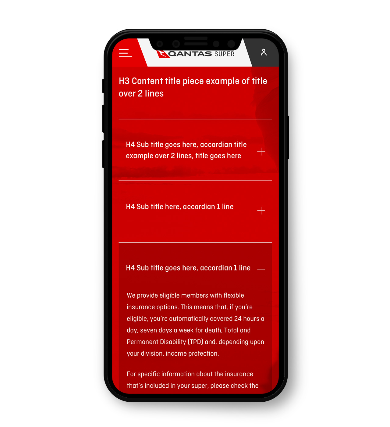
This life-stage and needs-based engagement model is a drastic and deliberate departure from the previous iteration which was a more traditional, product-focused website.
The solution
Based on the member-centric approach, a new UX approach was taken, with a focus on helping members at each life stage meet their needs.
Instead of focusing on business-led information about retirement and investments, we created an IA tailored to member needs at the four stages of their working lives. A complete UX/UI redesign was created to help users find information most relevant to them and take actions most effective for meeting their needs.
Starting with a more emotive, journey-focused homepage, we simplified the calls-to-action based on member needs at different points in their journey. This has immediately resulted in an upswing in engagement – more users are finding the information they need more easily, with fewer clicks and drop-offs across the site.
The new navigation design used analytics and insights from members to ensure that the most important and relevant information was easier to find.
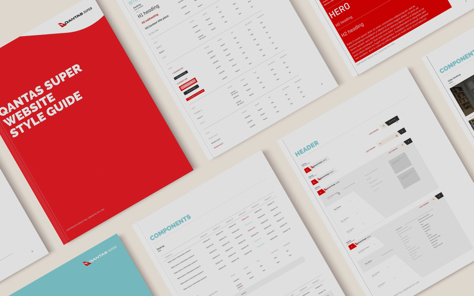
This member-focused experience was wrapped in an intuitive and engaging visual design, applying functional minimalism to provide a cleaner, more focused experience and encourage comprehension of the content. Micro-interactions and animations were used to keep users engaged, ensuring that the experience is enjoyable as well as effective.
The success of the site has been marked, with improvements in core metrics, as well as increasing adoption of persona-based pages and content. More members are finding the information that is relevant to them more easily, and are taking more of the actions that will set them up to have a great life after work.