Changing a brandmark can be dangerous. Your organisation may hold the copyright, but your customers feel a sense of ownership over it too. Making too drastic a change has the potential to alienate customers who are attached to the existing brand, even if they don’t consciously think they are.
In this blog, we’re going to look at five brand evolutions, from both within the financial service industry and further afield, to understand what makes strong and relevant branding that can stand the test of time and the winds of change…
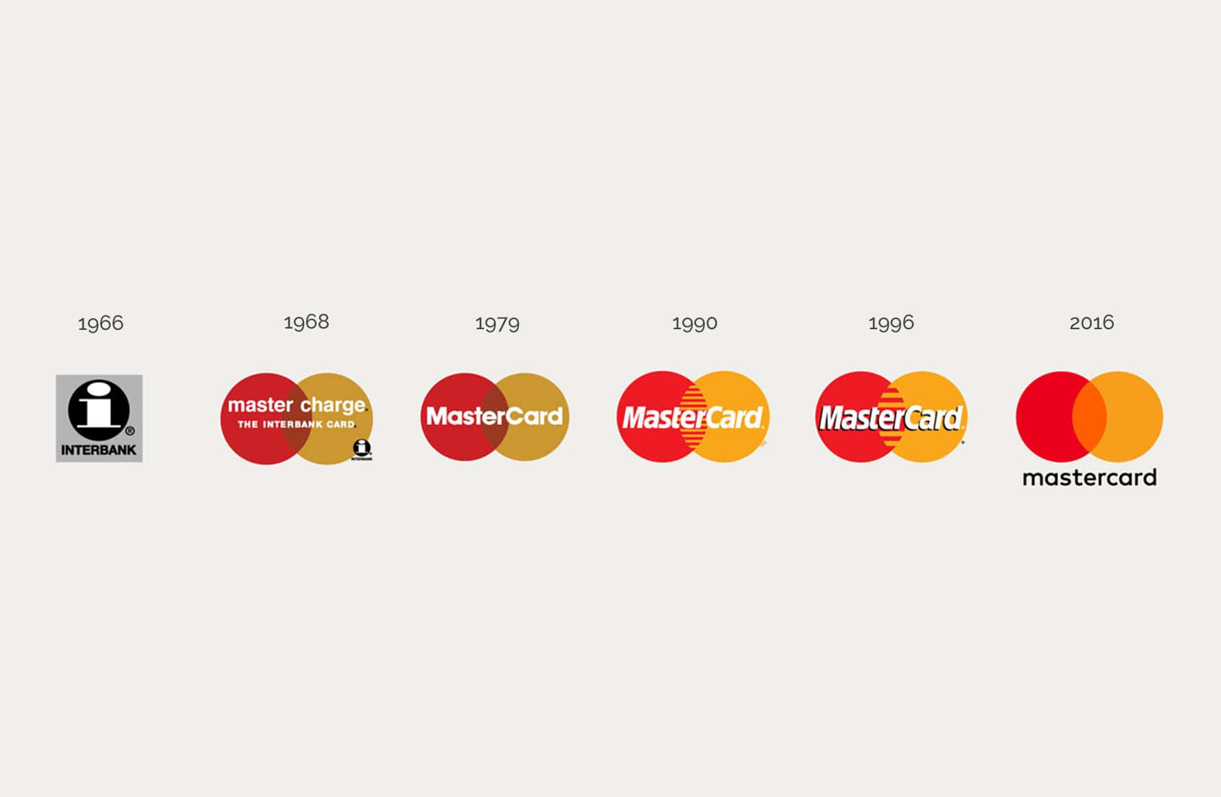
Mastercard. Agency: Pentagram
Initially established in 1968 as ‘Interbank’, Mastercard is about as universal a logo you can get. The global payments company is accepted at millions of locations in over 210 countries and territories worldwide. It’s most visibly seen on bankcards, but the forward-looking technology company had a rebrand in 2016 to work seamlessly across digital platforms.
This could easily be one of those rebrands where observers fall into the trap of commenting ‘I could have done that’ or ‘how did they pay so much money for changing so little?’
As a designer, it’s tempting to want to put your stamp on a project. However, Micheal Beriut’s team at Pentagram knew what made Mastercard distinctive: the red and yellow interlocking circles remained. However, the interlocking lines in the middle of the circles were replaced with a flat, optimistic orange to keep it simple and clean. Pentagram modernised the brand while keeping it true to its heart.
The sans serif, lower case wordmark is accessible and friendly, reminiscent of tech companies of today. Personally, the main takeaway from this brand evolution is how well the logo is demonstrated to work across all platforms from print to digital. It’s visible and distinctive, even on the smallest screens. It stands out without shouting.
However, after doing some of my own research I can see that the considered approach Pentagram took to demonstrate the logo working on different applications has not been applied in reality to the Mastercard mobile site. I wonder what happened here? The logo appears pixelated and the ‘responsive’ design is clunky and something to be desired.
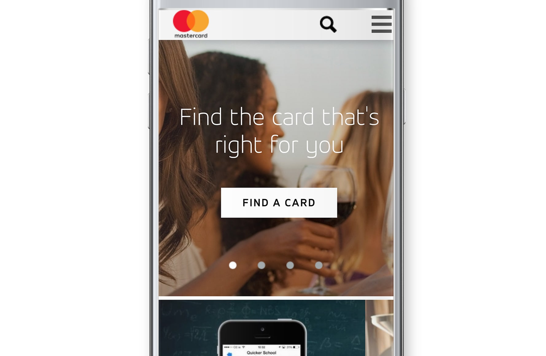
This is a reminder that companies need to see their re-brands through across all collateral if they want to be held up in public perception. The digital experience is just as important as any, and a negative one will impact on your brand.
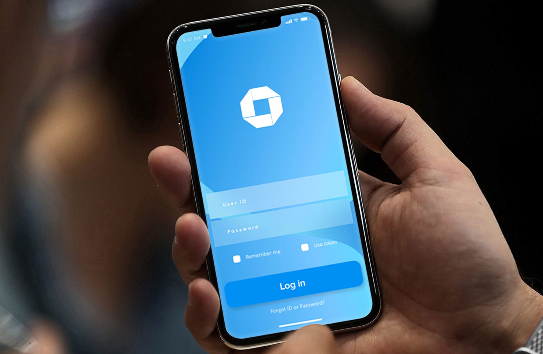
2. Chase Bank. Designer: Tom Geismar
JPMorgan Chase was born in 1961 following the merger of the Chase National Bank and the Bank of the Manhattan Company. And with it, a new identity.
Created by Tom Geismar, the design hasn’t changed one iota. There are very few big brands that haven’t had at least one iteration of their original design.
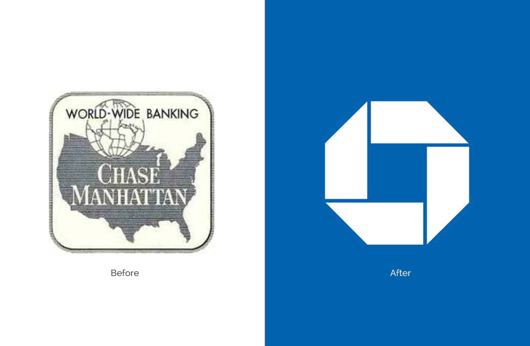
What was revolutionary about the logo at the time was its abstract form. It immediately distinguished itself from detailed, illustrated trademarks of the time.
When Geismar first the designed the logo, he kept in mind that it had to work for the different formats of the day – notably in black and white for newspapers. Even before digital, flexibility was still a consideration for practiced designers.
I think the beauty of this logo is that it sits back and lets the company do the talking. It symbolises unity, is understated but authoritative. Geismar believes in three principles for what makes a successful logo design:
- Appropriate – fits well for the client and their business
- Distinctive – stands out, but easy to recognise and memorise
- Flexible – works in different sizes and in various contexts
I think the majority of people would agree on these. If you are confident these criteria have been met, you are well on your way to a strong identity. Of course, it’s almost impossible to please everyone. In fact, Geismar says that it took some time for the bank’s employees to get on board with the branding. Creative director and industry authority Dave Trott argues that someone who ignores the big picture is ‘usually the dullest person in the room.’ I think we can safely say the Chase logo has proved those people wrong and stood the test of time.
3. IBM. Designer: Paul Rand
IBM may have reinvented itself a few times, but the tech behemoth’s last logo redesign was in 1972 and it hasn’t looked back since. IBM’s CEO in the 50s, Thomas Watson Jr, had a mantra: ‘good design is good business’ and so it has proved to be for IBM. Paul Rand, the visionary designer and art director employed by IBM at the time, meticulously modified the logo to its current version in 1972.
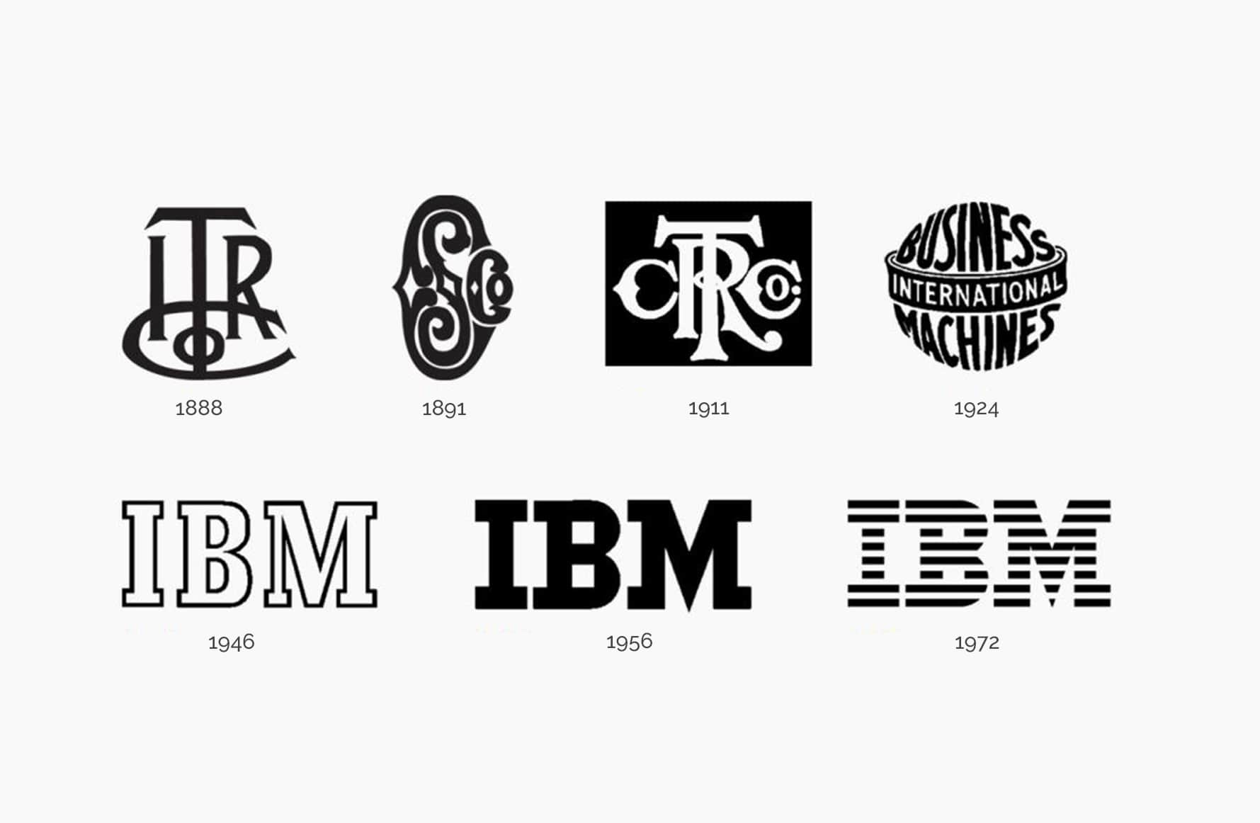
The letters stand confidently in a slab serif typeface (City) with the stripes running through them to suggest speed. It’s enduring and cemented into our visual culture, but still feels modern.
Rand also experimented and demonstrated the logo working across all applications to amplify the potential of brand as much as possible. He was very particular in his design guidelines and knew the value of good branding. But he maintained that a logo was only as good as the business it stood for. IBM has been in business for 107 years, and continues to innovate, solve problems and serve its customers. Good design is good business, and I think we will be seeing those 3 letters for some years to come.
4. Acorns to Raiz: In-house
In April this year, the investing app Raiz Invest, formerly Acorns Australia, had no choice but to re-brand after divesting from their US parent brand. Launched in Australia in 2016, it has quickly grown to over 100,000 users.
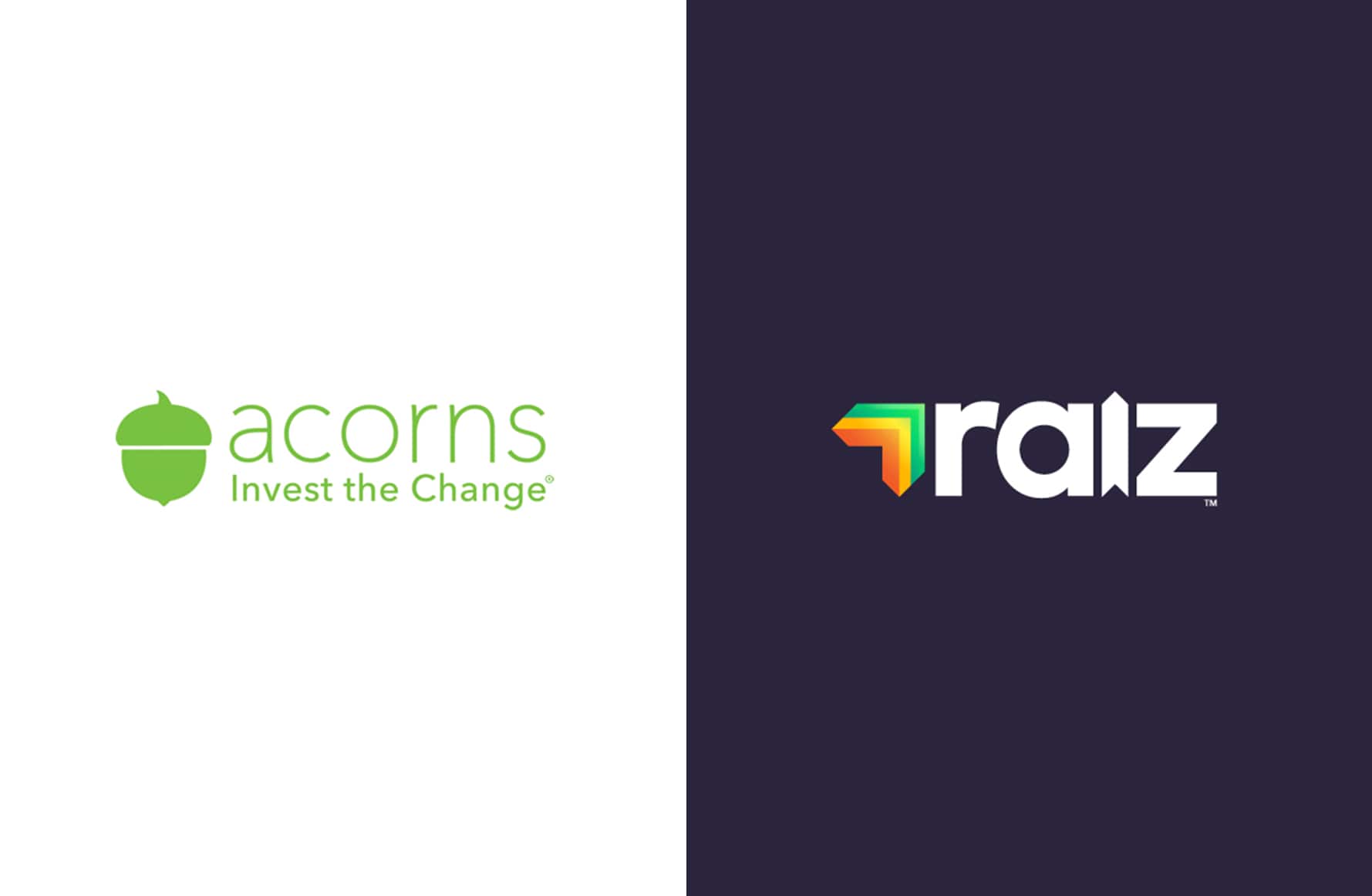
The original identity, Acorns – was fresh and simple. The name fitted with the idea of micro-investing, and rounding up purchases to invest the ‘change’ in exchange traded funds. The logo wasn’t revolutionary, but it did the job and appealed to those it was meant to serve. The lightweight, spacious wordmark and simple acorn graphic was friendly and assured. The rest of the digital interface was bright and colourful making for an engaging experience.
Unfortunately, not so much can be said for the re-brand to Raiz Invest. Undoubtedly, it’s a challenge to undertake a full-scale rebrand; and the in-house team supposedly came up with 500 names before whittling it down. However, I feel the name lacks inspiration, and the ‘zedifying’ of the name seems like a desperate attempt to appeal to a younger generation, or just score a URL that hadn’t been snapped up.
As for the logomark itself, it’s disappointing compared to the clear and single-minded logo it replaces. The letters are a little squashed and heavy and the ‘I’ has been designed to look like an arrow moving upwards. Raiz = raise = upwards. We get it. It’s a little unoriginal but…fine.
However, the arrow element to the left of the name seems like an entirely unrelated and somewhat unnecessary element. Each of the 4 arrows has a gradient that produces a 3D effect, contradicting the flat letters of ‘raiz’. Why are the arrows even there? The ‘i’ is already doing the job of the raise visual pun. Overall this change gives the impression of being disjointed – too many ideas and not enough editing down to a simple, effective brandmark. The business itself is fantastic, but it’s a shame that the clarity of the experience is not conveyed through this logo.
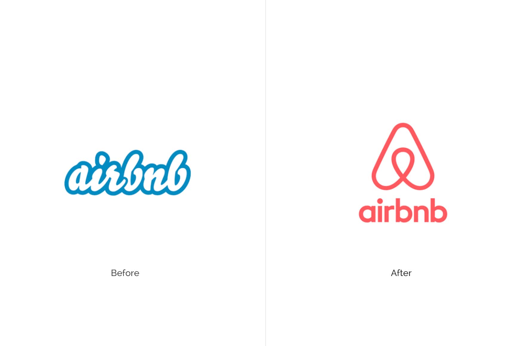
5. Airbnb. Agency: Design Studio
Airbnb is a new kid on the block in terms of some of the other companies featured here, but from its birth in 2008 it has grown at an exponential rate to 150 million users across the globe. Their latest rebrand in 2014 caused a stir – so much so that it trended on Twitter for 8 hours. The internet had an unsurprisingly opinionated response to the new mark (which has its own name by the way – the Bélo), comparing it to an array of representations, some of which you can only imagine.
Perhaps the reaction to Airbnb’s logo not only reflects the polarising times we live in, but also because Airbnb elicits an emotional response in people – we are talking about people’s homes. The brand itself is such a personal one.
London-based agency Design Studio fully embraced the re-brand. They undertook an extensive research process to completely understand the Airbnb experience. The team met 18 hosts, conducted 120 employee interviews and stayed in 13 cities. Design Studio says, ‘Our creative strategy was informed deeply by the insights we uncovered in the immersion’.
The Bélo symbolises ‘People, Places, Love and Airbnb’.
The team behind the project understood the importance of standing for something, and the value of a strong brand. The proposition of ‘Belong Anywhere’ was informed by learned insights and is reflected in all collateral.

Whether the Airbnb experience makes you feel like ‘you belong anywhere’ or not, the branding and the customer experience, on and offline, is one of the most seamless and holistic approaches to design I have encountered. It will be interesting to see where Airbnb takes this next.
So, what have we learnt?
Great logos are a visual representation of your company’s values and should connect with your audience. There is no hard and fast rule to good branding. But starting with a simple, distinctive and forward-looking logo should stand the test of time. Don’t be scared to be pioneering – the logos we’ve seen were daring for their time. Overall, the branded experience should help customers easily navigate through your product or services, and serve them across all applications.
When it comes to rebranding, companies often hastily make the wrong decision to change a much-loved logo. So don’t forget to question why you want an update. Rebrands that work successfully are usually done when the company has evolved, or wants to appeal to a new and expanded customer base. You should question your values and whether these have changed. Practical points to consider are, how does your logo compare to competitors, and how does it sit next to other brands? Also, it doesn’t always have to be a drastic change. Some fine-tuning and a bit of tweaking can bring it up-to-date.
Above all, make the time to be bold but don’t forget to be thorough. And remember, designers would argue that an iconic logo is one that anyone can draw.